WHAT ITS FOR:
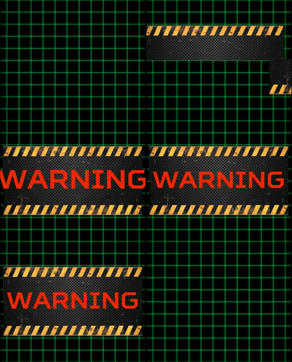
With this object, you can display messages (A huge spaceship is approaching!!!), display pictures (a character talking…), and animate their in and out screen transitions.


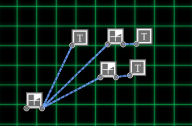
Objects used to make the above effects: text objects plugged to countdown objects for timing.
PROPERTIES:
![]() Name text field: the name of the object.
Name text field: the name of the object.
BEHAVIOR
![]() Stay activated radio button: once the trigger is activated, it stays activated.
Stay activated radio button: once the trigger is activated, it stays activated.
![]() Switch mode radio button: the trigger behaves like a switch.
Switch mode radio button: the trigger behaves like a switch.
![]() Switch mode but play until the end radio button: the trigger behaves like a switch, but once activated, it will play until its duration.
Switch mode but play until the end radio button: the trigger behaves like a switch, but once activated, it will play until its duration.
The text can have a start transition, then stays on screen for some time, then can have an out transition.
ON SCREEN
![]() Duration spinner: after the in transition, how long will the text stays on-screen
Duration spinner: after the in transition, how long will the text stays on-screen
TYPE: the text can be a picture saved from a paint program, or a text using a font.
![]() Picture radio button: picture mode, using a picture saved in the pictures directory in assets
Picture radio button: picture mode, using a picture saved in the pictures directory in assets
![]() Picture menu: choose your picture
Picture menu: choose your picture
![]() Text radio button: text mode
Text radio button: text mode
TEXT FIELD:
![]() Font menu: you can choose the font (see Importing a font)
Font menu: you can choose the font (see Importing a font)
![]()
![]()
![]() Align menu: the text-align: to the left, center, or to the right
Align menu: the text-align: to the left, center, or to the right
![]() size: the text size.
size: the text size.
![]() Color: the text color.
Color: the text color.
![]() character timing (char. timing) spinner: instead of displaying the text in one go, you can use this value to display the text letter by letter. This property allows choosing the time between each newly displayed letter.
character timing (char. timing) spinner: instead of displaying the text in one go, you can use this value to display the text letter by letter. This property allows choosing the time between each newly displayed letter.
You can choose the letter sound in the Game editor / Settings panel.
POSITION:
![]() Horizontal position spinner: the horizontal position.
Horizontal position spinner: the horizontal position.
![]() Vertical position spinner: the vertical position.
Vertical position spinner: the vertical position.

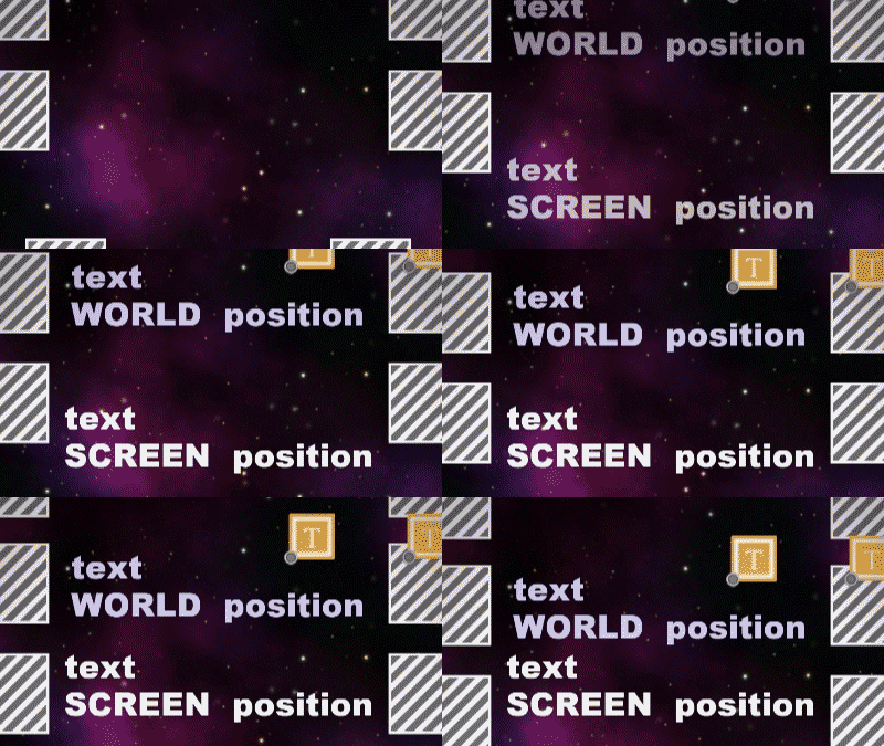
![]() World position checkbox: by default, the text is displayed on top of the screen. If you check this property, the text will be displayed at the text game object position. In this case, you can choose where you want to display the text on the level.
World position checkbox: by default, the text is displayed on top of the screen. If you check this property, the text will be displayed at the text game object position. In this case, you can choose where you want to display the text on the level.
RENDERING ORDER:
![]() automatic: rendering order depends of the activation order
automatic: rendering order depends of the activation order
![]() normal > order spinner: forcing order
normal > order spinner: forcing order
TRANSITION IN:
The start transition. You can choose to use fading, translation, scale or rotation animation, or even combine all this.
![]() DURATION spinner: the transition duration.
DURATION spinner: the transition duration.
![]() Fade checkbox: if checked, the text will fade from transparent to opaque.
Fade checkbox: if checked, the text will fade from transparent to opaque.
![]() POSITION checkbox: if checked the text will translate:
POSITION checkbox: if checked the text will translate:
![]() From left to right radio button.
From left to right radio button.
![]() From right to left radio button.
From right to left radio button.
![]() From top to bottom radio button.
From top to bottom radio button.
![]() From the bottom up radio button.
From the bottom up radio button.
![]() SCALE checkbox: if checked the text will change its scale from this value.
SCALE checkbox: if checked the text will change its scale from this value.
![]() degree spinner: the start scale percent.
degree spinner: the start scale percent.
![]() ROTATION checkbox: if checked, the text will start with a rotation and rotate to the default orientation.
ROTATION checkbox: if checked, the text will start with a rotation and rotate to the default orientation.
![]() Degree spinner: the start rotation in degrees.
Degree spinner: the start rotation in degrees.
TRANSITION OUT:
The end transition. You can choose to use fading, translation, scale or rotation animation, or even combine all this.
![]() DURATION spinner: the transition duration.
DURATION spinner: the transition duration.
![]() Fade checkbox: if checked, the text will fade from transparent to opaque.
Fade checkbox: if checked, the text will fade from transparent to opaque.
![]() POSITION checkbox: if checked the text will translate:
POSITION checkbox: if checked the text will translate:
![]() From left to right radio button.
From left to right radio button.
![]() From right to left checkbox.
From right to left checkbox.
![]() From top to bottom checkbox.
From top to bottom checkbox.
![]() From the bottom up checkbox.
From the bottom up checkbox.
![]() SCALE checkbox: if checked the text will change its scale from 100% to this value.
SCALE checkbox: if checked the text will change its scale from 100% to this value.
![]() Percentage spinner: the end scale.
Percentage spinner: the end scale.
![]() ROTATION checkbox: if checked, the text will rotate.
ROTATION checkbox: if checked, the text will rotate.
![]() Degree spinner: the end rotation in degrees.
Degree spinner: the end rotation in degrees.
